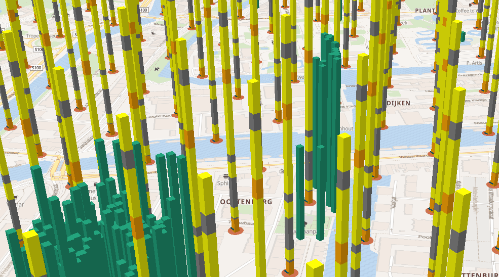
blog Country-Wide Terrain Tiles on Demand At the start of 2024, our team at Sogelink Research embarked on an exciting project: developing an open-source service called CTOD which stands for Cesium Terrain On Demand. This service
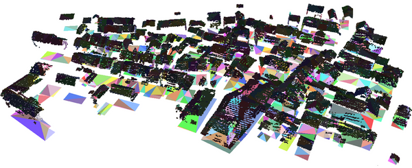
3D The possibilities and limitations of City3D as large-scale 3D building reconstruction model During my internship, I had the opportunity to explore the possibilities and limitations of City3D: a 3D Building Reconstruction program developed by TUDelft (Huang et al., 2022). City3D offers a
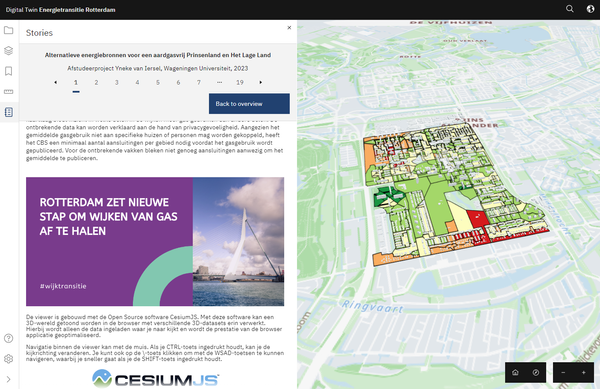
De energietransitie in een Digital Twin-demo Energietransitie Nu we niet alleen voor het klimaat, maar ook voor onze portemonnee moeten besparen op (fossiele) energie, willen steeds meer mensen weten hoe dat het beste kan. Ook de
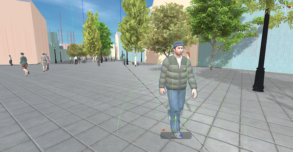
3D Digital Twin: The Netherland in game engines For a while we have been helping Arnhem municipality with a digital twin they could use for their city. This followed previous efforts of our research group to develop digital
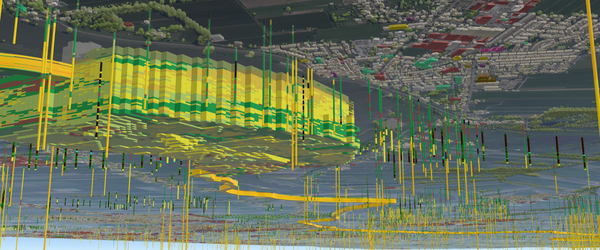
blog Cesium & 3D tiles as a python module A few months back, we were approached by Deltares to help them work on the TKI DigiTwin Waterkering en Ondergrond project. The project aims to push further subsurface analysis in
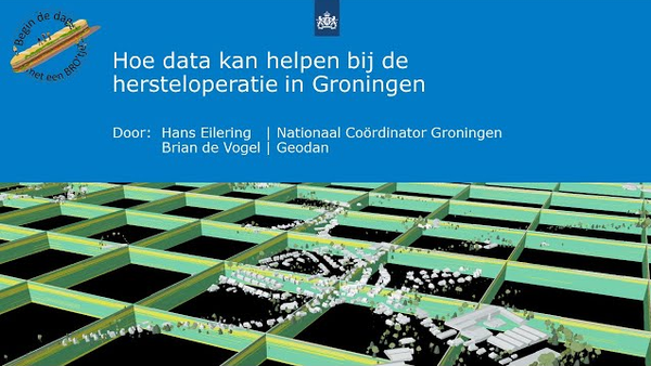
Hoe data kan helpen bij de hersteloperatie in Groningen Het NCG is verantwoordelijk voor de versterkingsoperatie van duizenden panden en onderzoeken of een Digital Twin met de juiste informatie voor verschillende gebruikers hun kan helpen om deze operatie te
3D Tiles 1.1 - Implicit tiling Recently the 1.1 version of 3D Tiles was released. One of the new features is 'implicit tiling'. When using this feature the spatial data is divided in a regular
Verhalen in het landschap waarin het land minder plat is dan het lijkt Nederland is best plat. Behalve een paar heuvels in Limburg bestaat ons landschap overwegend uit moeras en glooiende zandruggen. De kleine
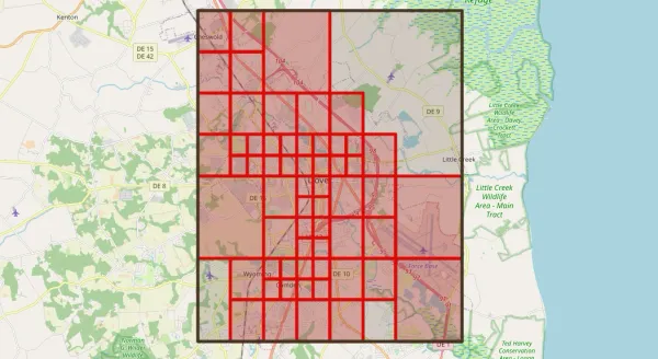
blog Computationele ondersteuning voor crowd management Een rapportage van de stappen en uitkomsten van afstudeeronderzoek voor de Master Engineering & Policy Analysis aan de TU Delft, gericht op het leveren van operationele ondersteuning aan crowd managers.
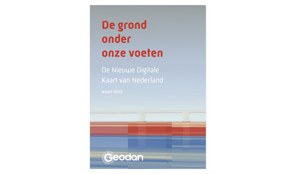
ondergrond De grond onder onze voeten Als research en Geodan mochten wij meewerken aan de totstandkoming van de Basisregistratie Ondergrond [https://basisregistratieondergrond.nl/] (BRO). Wat begon als één enkele proof of concept, is inmiddels uitgegroeid tot
3D depictions of the subsurface The earth below our feet reaches thousands of kilometers deep. For large parts of the continents, the top few kilometers were mapped by - among others - companies and governments
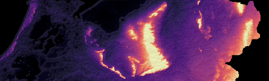
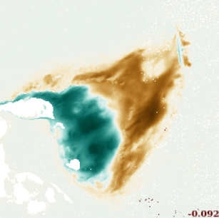
De geotop als geotiff 💡Dit artikel is een verkorte versie van een interactief notebook dat hier is te bekijken: https://observablehq.com/@geodan/de-geotop-als-geotiffDe geotop van Nederland is onderdeel van de 'BasisRegistratie Ondergrond [https:
blog GIS and BIM integration Voor het rapport “GIS and BIM integration: A High Level Global Report” is Henk als thought leader door Geospatial World geïnterviewd over het onderwerp. Lees hieronder het interview, het hele
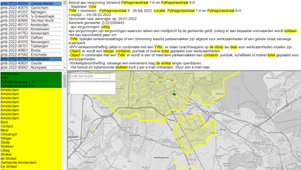
demo Geotaggen van overheidsbekendmakingen Dutch language article. About POC 'geotagger'. A service that scans documents such as public announcements for geographic location identifiers (names, addresses, postal codes) and attaches corresponding 'geotags' to the document. Geotags can later be used to retrieve documents by location.
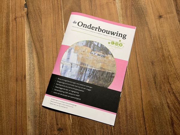
3D Een Digital Twin voor de Nederlandse ondergrond In de november editie van "de Onderbouwing", het magazine van het Centrum Ondergronds Bouwen (COB), zijn Edwin van Rooijen (directeur LOCATIQS Group), Henk Scholten (directeur Innovatie Geodan) en Brian de Vogel (Geodan) geïnterviewd over datagedreven werken en de ondergrond.
blog How to make a vectortile-basemap This blog post is a written version of a presentation I gave earlier at the postgisday2021. It shows how we went from raw data to a basemap on national level.
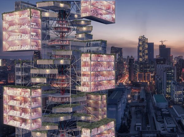
Digital Twin Post-Pandemic Cities Throughout history, cities have been a product of their social, cultural and economic context. Few things can change this context so radically as a pandemic, like the one the world went through in the last two years. What does the future city look like after Covid-19?
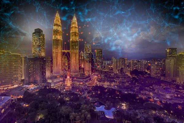
Digital Twin Digital Twin Frameworks What should a digital twin's overall architecture look like, while aiming at replicating main urban features and processes? Some scholars developed different frameworks for urban digital twins, considering the complexity of cities.
blog De Digitale Dijk De hevige regenval in Limburg juli 2021 liet zien dat onze waterkeringen van levensbelang zijn. Door gebruik te maken van innovatieve GIS technieken kunnen we zorgen voor meer inzicht en efficiënter beheer en onderhoud van onze waterkeringen.
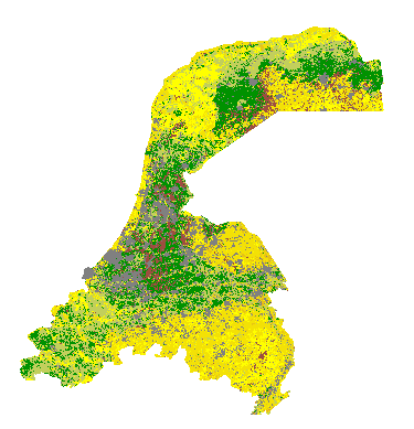
blog Sporen in het land Het nieuwe hoogtemodel van het AHN is uit. Dit artikel geeft een aantal opvallende voorbeelden van plaatsen in Nederland waar we de nieuwe data vergelijken met de situatie van 5 jaar geleden aan de hand van kaarten.
blog The Synthetic Data Promise for Research Each year, more data are produced than the year before. In 2020, over 59 zettabytes (1 ZB = a trillion gigabytes) has been “created, captured, copied, and consumed in the world”
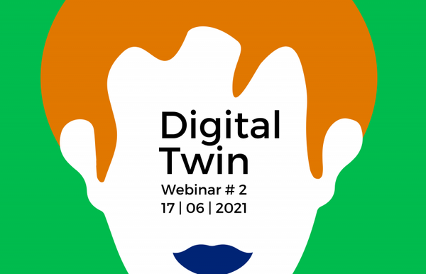
Webinar Digital Twins The 17th of June Henk and Brian were invited by Data Science Alkmaar to be part of a webinar and talk about Digital Twins
blog GIS-data in game engines: Case studies De oplettende lezer heeft gezien dat ik in mijn vorige blog een belofte heb gedaan, namelijk dat ik uit zou wijden over hoe we nou precies zo’n 3D-omgeving in
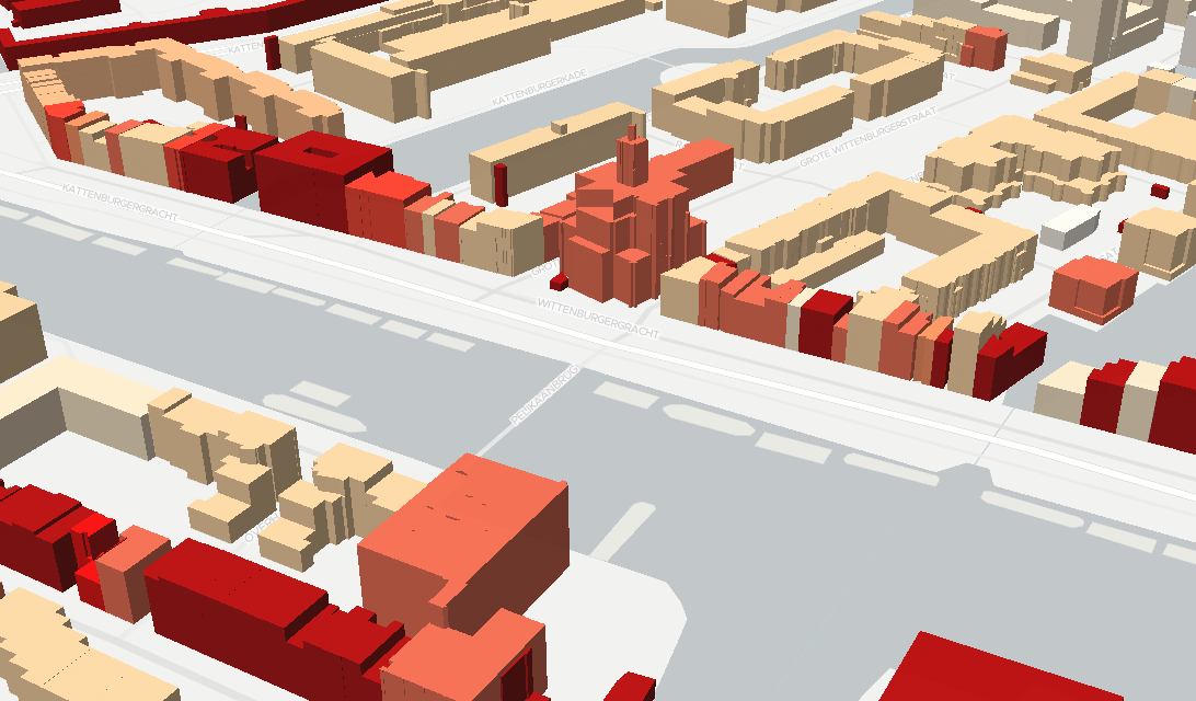
blog All Dutch 3D buildings in 1.9 GB In March 2021, the Dutch Kadaster published the 3D Basisvoorziening, which is 3D data representing the Netherlands. The data is to be updated every year. There are 3 main datasets:
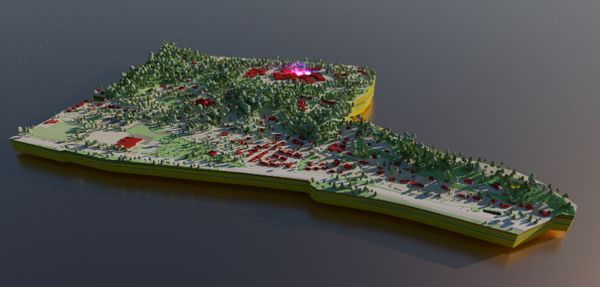
demo Digital Twin - Terrain The scene in the viewer can be exported as GLTF which we than can use to render something in BlenderA prototype of our Digital Twin viewer with terrain and subsurface