A few months back, we were approached by Deltares to help them work on the TKI DigiTwin Waterkering en Ondergrond project.
The project aims to push further subsurface analysis in view to re-enforce flood defenses infrastructures. Geodan research participates in such a task, leveraging our existing digital twin infrastructure to ingest partners and expert data on the matter. The intended result is that industry partners will be able to describe and predict the behaviour of flood defenses in 4D (3D in space and time) in an advanced way, so that it becomes possible in the consultancy to assess and improve flood defenses more accurately.
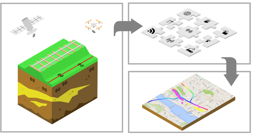
The datafusion toolbox
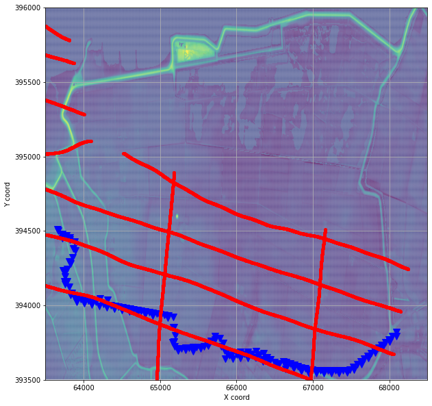
Within this project, Detares has developed a machine learning toolbox, the Datafusiontool that can predict soil type and stratigraphy at any given locations (in red below) from discrete Cone Penetration Test (CPT) in blue.
In order for its end user to perform a visual check of the outcome of such modelling technique, we have created a module, written in python, that plots intermediary results into a 3D viewer.
The ML toolbox output looks like follows; a matrix of values indexed with a set of x,y,z coordinates (in RD, EPSG:28992),step dx,dy,dz in between points and diverse values (resistivity and Soil behavior index in our example).
with open('data/ML_output_data.pickle','rb') as f:
    [idx, x, y, z, dx, dy, dz, values] = pickle.load(f)
The most straightforward manner to visualise such a matrix is by using matplotlib scatter plot
import matplotlib.pylab as plt

# Creating figure
fig = plt.figure(figsize=(10, 7))
ax = fig.add_subplot(projection='3d')
ax.set_position([-0.12, 0.0, 1, 1])
ax.view_init(20, -75)

cmap = plt.get_cmap('gist_rainbow', 11)

# plot data
im = ax.scatter(x, y, z, c=values['label_values'][1],
                vmin=1, vmax=3.6, cmap='gist_rainbow')

# axis labels
ax.set_xlabel("X RD", fontsize=10)
ax.set_ylabel("Y RD", labelpad=20, fontsize=10)
ax.set_zlabel("NAP [m]", fontsize=10)
ax.set_zlim(10, -20)

# legend
cax = plt.axes([0.85, 0.25, 0.02, 0.5])
cbar = plt.colorbar(im, cax=cax, fraction=0.1, pad=0.01)
cbar.set_label("IC [-]", fontsize=10)
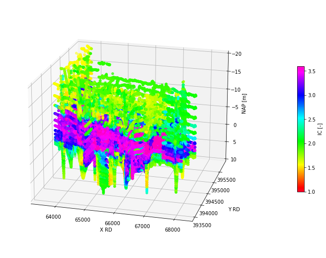
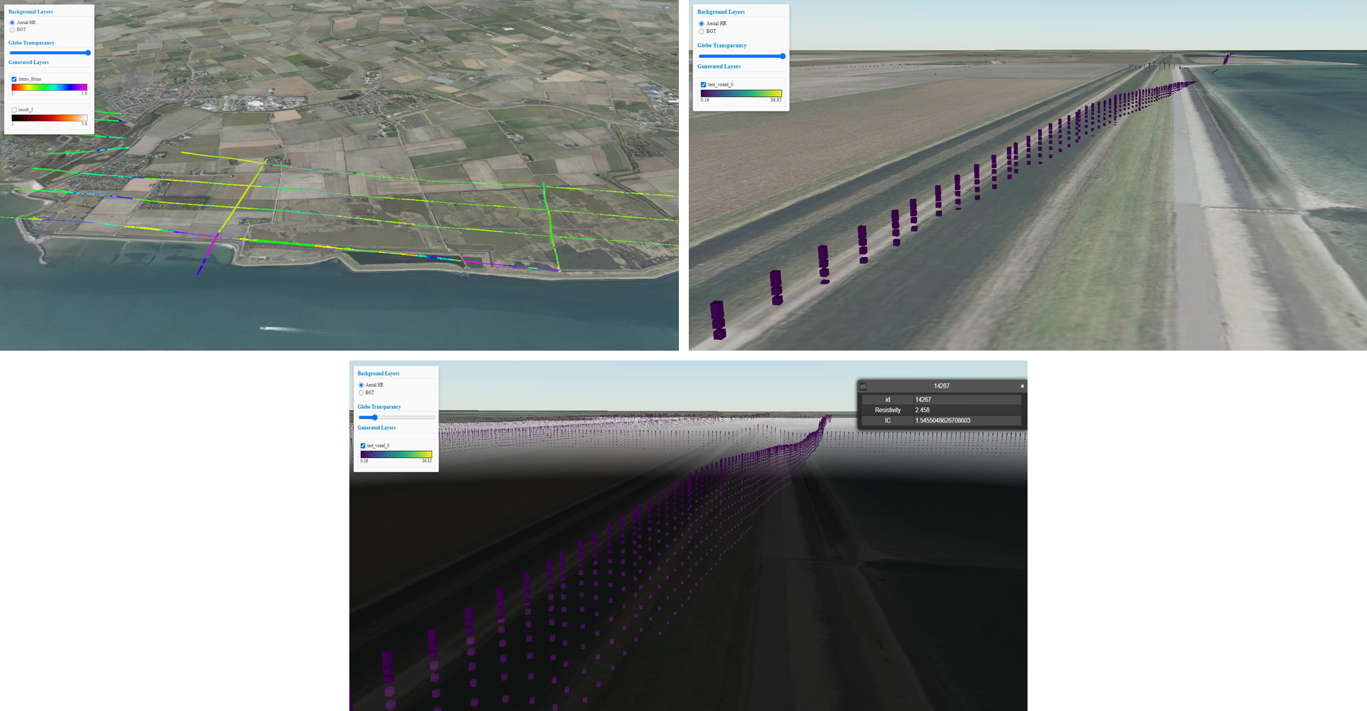
If useful for a quick check, the plotting does not give much insightful information. The idea is to bring it into a 3D map in view to visualise the data on-the-fly, and this, packaged as a python module.
Visualisation Module
We developed the visualisation module based on Cesium (The Platform for 3D Geospatial), voxel 3D data and b3dm tiles.
We first create a CesiumViewer object setting the result_folder where Voxel Tiles will be stored and a port to serve the Cesium viewer locally.
from DataFusionTools.visualisation.cesium import CesiumViewer

viewer = CesiumViewer(result_folder='./data/', port=8080)
Then, voxel_tiles are generated from the numpy arrays continuing x,y,z, dx,dy,dz and the values. The tile name and colorscale is also set at this stage.
In practice, the numpy arrays are transformed to Voxel using open3d library and then saved as Batched 3D Model tiles using the py3Dtile, a python library Python tool and library for manipulating 3D Tiles.
viewer.generate_voxel_tiles(xyz,dxdydz,values,name = 'test_voxel_0',colorscale = 'viridis')
viewer.voxel_tiles.write_tiles()


You can check which tiles have been created and ready to be served by the viewer.
viewer.cesium_server.tiles_served
['test_voxel_0']
The cesium viewer isn’t running yet. You can start it with the cesium_server.start_server() command.
viewer.cesium_server.start_server()
print(viewer.cesium_server.url)
Tiles are served at the following url
Viewer.cesium_server.tiles_url
[{'name': 'test_voxel_0',
'resource': 'http://localhost:8080/tiles/test_voxel_0/tileset.json',
'colorbar': 'http://localhost:8080/tiles/test_voxel_0/colorbar.json'}]
We can now take full advantage of the cesium viewer to check our results with spatial context.