
The earth below our feet reaches thousands of kilometers deep. For large parts of the continents, the top few kilometers were mapped by - among others - companies and governments searching for such riches as freshwater, iron, coal, oil, and gold. In the last decades, many IT companies have been creating software to manage and depict this sub-surface information in fanciful 3D viewers.
One such depiction was created by a former colleague using Minecraft. The Minecraft environment, a game software normally used by younger kids to create imaginative worlds, was converted into a very nice subsurface viewer. He took the idea to replace the subsurface with transparent glass Minecraft cubes of several colors. Although conceptually simple, I believe the result to be quite effective. This Minecraft video shows the outline and location of an ancient volcano that is now buried deep under the Waddenzee in the north of the Netherlands.
Much of the subsurface data pertains to the first few hundred meters. These shallow subsurface layers are especially interesting for people at the surface just above. Think of, for example, builders looking for the best foundation under a building or road, dwellers looking for groundwater, energy savers looking for optimal long-term storage of heat and cold. In the Netherlands, information about these uppermost layers is made publically available by the BasisRegistratie Ondergrond (BRO) as GeoTOP (first 50 meters, lithology) and REGIS (first 200-500 meters, hydrology).

The image above (courtesy BRO) shows very clearly that this kind of information can be very useful. However, while looking at the image, you may wonder what is below the wind turbine in the top corner, or under the left-most house in the street.
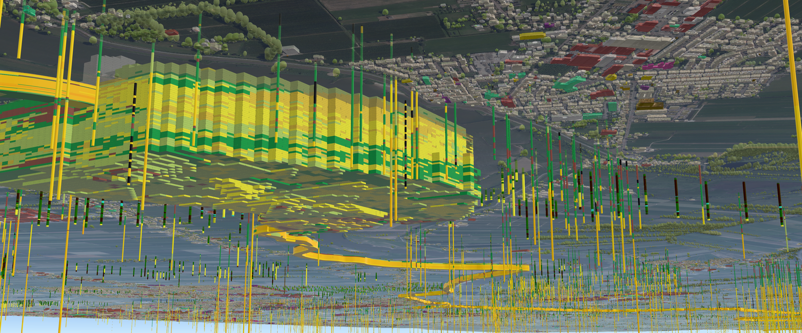
The problem of the opaque sub-surface can be solved by just showing the area of interest. The image below shows only the subsurface information that is relevant for reinforcing the 'Lekdijk', a flood defense infrastructure against high water levels in the Lek river (courtesy of Geodan Research). The downward-pointing tubes represent drilling probes, the stacked layers represent the outcome of a statistical model based on the information obtained from the drillings, the yellow-colored 3D wall that winds toward the horizon represents the sub-surface just under the dike.
For general purpose maps, the relevant data cannot be automatically filtered out. Some software solves this problem by letting the user draw a line across the map and a cross-section along this line will be presented in a separate window. Another colleague recently posted an innovative way to show the underground by combining the cross-section with a slider to interactively peel off layers.
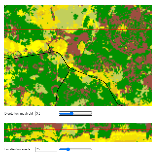
Top-part: view from above, the red line shows the location of the cross-section, the black line is a railway (for reference). Bottom part: cross-section view, the red line shows the depth at which the top part is peeled off.
Another visualization by Geodan Research lets you dig a hole at a certain location to view what lies under.
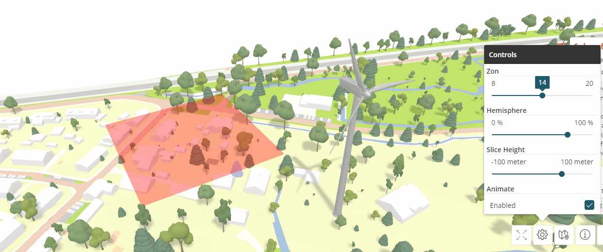
Some viewers can be used with 3D goggles and project virtual objects into the surrounding environment, this type of application is called 'augmented reality'. In this application, also created by Geodan Research, a virtual piece of a city and its top subsurface layers is projected onto a real-world tile floor. The 3D data for a particular location can be viewed by extracting a 3D bar of subsurface into the air at a selected location. The layers in the extracted bar can then be inspected by the user.

Yet another way is to show a so-called fence diagram (hekdiagram).

A fence diagram shows the sub-surface at regular intervals in the map. This kind of diagram can be used to show detailed sub-surface information for large map areas. Fence diagrams can be drawn on top of a map layer so that the map can be viewed from above as most of us are used to, or under the map layer so that the sub-surface layers are depicted where they actually are (but you now have to view the map from under, which many users may find confusing). Note that in both depictions the map is largely obscured by the diagram.
For a current project, we are looking at possible locations to store (summer-)heat and (winter-)cold in the subsurface for saving energy. For some storage types, it is important to know where in the sub-surface the so-called aquifers are located. These water-conducting sand layers are good targets for the storage of heat and cold. Instead of using map-obstructing fence diagrams, in this project, we use vertical bars. A shortcoming of the particular viewer software being used is that these bars can only be drawn on top (not under) the map. This forced us to make a virtue out of necessity and put the sub-surface information on top of the map. I believe that a positive side-effect of this approach is that users perceive a very precise idea of both the location and the depth in relation to the surroundings.

3D depiction of the sub-surface. Higher means deeper. In yellow are sand layers. Blue is the groundwater level. The green bars show the locations and depths where heat and cold are being exchanged with the sub-surface. The orange circles show the calculated heat-exchange potential for a particular location (darker=better). Note that the map can still be used for orientation and depths can be well perceived.
This 3D depiction is part of the Tomahawk proof of concept viewer that is currently being developed. These and other 3D subsurface layers can be found in the viewer, look for the 3D layers under categories 'BRO REGIS' and 'WKO Tool'. You need to zoom in to the location of your interest to make these layers visible.